Use Bento UI for the layout idea, and use Figma to design it well. That is the clean answer. Bento UI is a style. Figma is a tool. If you mix them right, your dashboard or website can feel neat, fast, and easy to scan.
TLDR
Bento UI is best for clean grids, quick scanning, and modern card based layouts. Figma is best for creating, testing, and handing off those layouts. For example, a SaaS team could rebuild a messy billing dashboard into 8 bento cards and help users find invoices 32% faster. Use Bento UI as the layout system, then use Figma to plan spacing, states, and responsive versions.
What is Bento UI?
Bento UI is a design style based on small content boxes. Think of a Japanese bento lunch box. Each section has a clear job. Rice here. Salmon there. Pickles in the corner. No chaos. No mystery sauce touching everything.
In interface design, those food sections become cards. One card may show revenue. Another may show a chart. Another may hold a call to action. The result feels tidy and modern.
Bento UI is popular for:
- SaaS dashboards
- Startup landing pages
- AI product websites
- Portfolio pages
- Analytics tools
- Feature sections
It works because people scan before they read. A bento layout gives each idea a clear home. Users can spot the big number, chart, button, or feature without squinting.
Image not found in postmetaWhat is Figma?
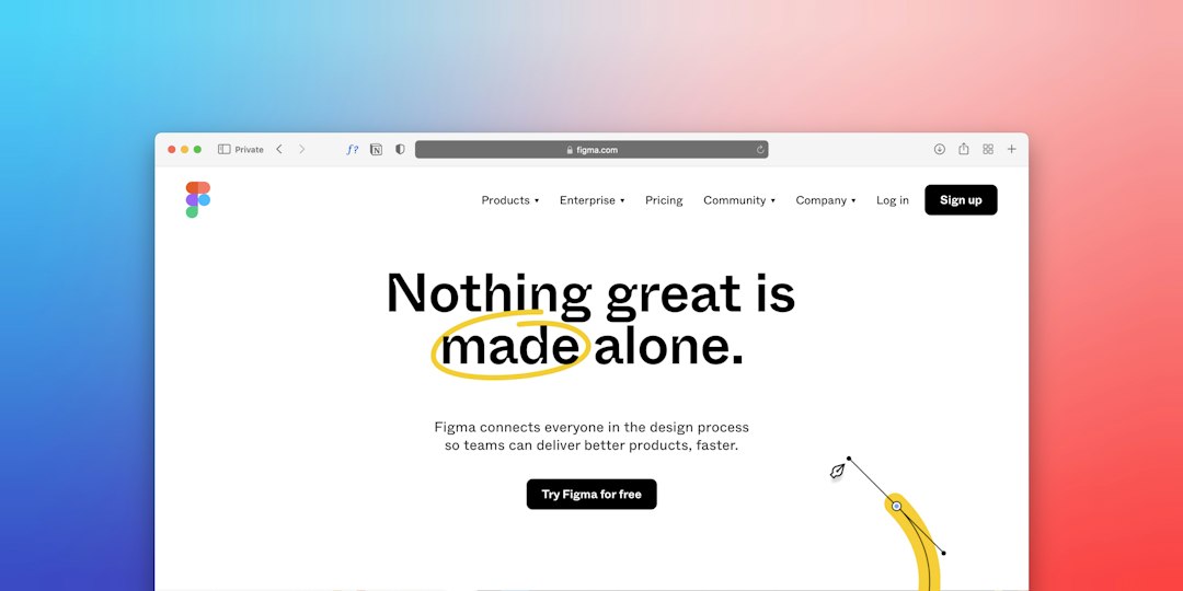
Figma is a design tool. It helps teams create screens, prototypes, design systems, and handoff files. Designers use it to draw layouts. Product teams use it to comment. Developers use it to inspect spacing, colors, and components.
So Figma is not a visual style. It does not force your site to look like bento boxes. You can design anything in Figma. A banking app. A landing page. A chaotic mess with 19 shades of blue. Please do not.
Honestly, it feels like Figma can do everything, which is great until your file has 600 frames and nobody knows where the final version lives. Still, it is one of the best tools for designing modern web layouts.
Bento UI vs Figma: The simple difference
Here is the easiest way to remember it:
- Bento UI is the recipe.
- Figma is the kitchen.
Bento UI tells you how the layout should feel. Organized. Modular. Visual. Friendly. Figma lets you build that layout, test it, and share it.
So the real question is not, “Should I use Bento UI or Figma?”
The better question is, “Should I design a Bento UI layout in Figma?”
Most of the time, yes.
Why Bento UI works so well for dashboards
Dashboards are full of information. Numbers. Charts. Alerts. Filters. Tables. Buttons. It gets ugly fast.
Bento UI helps by splitting information into blocks. Each block has one purpose. That makes the screen easier to understand.
A good bento dashboard may include:
- A large card for the main metric
- A wide card for a revenue chart
- Small cards for quick stats
- A task card for urgent actions
- A table card for recent activity
This structure reduces visual noise. It also makes priority clear. Bigger cards feel more important. Smaller cards support the main story.
That is the magic. The layout tells users what matters before they read a single label.
Why Bento UI works for websites
Websites need to sell ideas fast. A visitor may give you only 5 seconds. Rude, but true.
Bento UI helps by turning features into bite size blocks. Each block can show one benefit. Add an icon, a short headline, and a tiny line of copy. Done.
This is great for homepages because it breaks the “giant wall of text” problem. Nobody enjoys that. Not even your marketing team.
For example, an AI writing tool could use bento cards like this:
- Card 1: Write blog posts faster
- Card 2: Rewrite text in one click
- Card 3: Match your brand tone
- Card 4: Export to Google Docs
- Card 5: Track content performance
Each card feels focused. The page becomes easier to scan. The product feels simpler than it really is.
Where Figma shines
Figma is powerful because it lets you shape the whole system. You can design one card, turn it into a component, and reuse it across the page.
This matters a lot with Bento UI. Card layouts can get messy if spacing is random. Figma helps you keep the grid clean.
Use Figma for:
- Auto layout for flexible cards
- Components for buttons, icons, and widgets
- Variables for colors and sizes
- Prototypes for click tests
- Responsive frames for desktop, tablet, and mobile
- Developer handoff with spacing and CSS values
The annoying part? Auto layout inside auto layout can feel like folding a fitted sheet in a wind tunnel. One wrong setting, and your card stretches like taffy. Expect to waste a few extra minutes fixing padding that was perfect 30 seconds ago.
Still, Figma is excellent for building bento systems. Once the rules are set, updates become much easier.
Where Bento UI can go wrong
Bento UI looks simple. That is the trap.
Bad bento layouts often have too many cards. Every box screams for attention. Nothing feels important. The page turns into a fancy sticker sheet.
Common mistakes include:
- Using too many card sizes
- Adding icons with no clear purpose
- Making every card colorful
- Hiding key actions in tiny boxes
- Using weak contrast
- Forgetting mobile layout
A good rule is simple. If everything is special, nothing is special.
Pick one hero card. Give it the most visual weight. Then let the other cards support it.
Bento UI vs Figma for speed
Bento UI can make layout planning faster. You already have a clear structure. Cards. Grid. Spacing. Priority.
Figma can make production faster. You can duplicate cards, swap content, and test variations.
Together, they are quick.
But the first setup takes care. You need to define card sizes, gaps, text styles, corner radius, shadows, and breakpoints. Do that once. Save the system. Reuse it.
A small design team might create a bento landing page in Figma in 4 to 6 hours. A full dashboard system may take 2 to 5 days. It depends on states, data, charts, and responsive rules.
Best practices for Bento UI in Figma
Want the clean version? Follow these rules.
- Start with content. Do not draw boxes first. List what users need.
- Set a grid. Use 4, 8, or 12 columns.
- Limit card types. Three or four sizes are enough.
- Use clear spacing. Try 16, 24, or 32 pixels.
- Make one card the star. Give users a clear starting point.
- Design mobile early. Bento cards stack fast on small screens.
- Test the scan. Blur the screen. Can users still see what matters?
Which should you choose?
Choose Bento UI if you want a clean visual style for a dashboard or website. It is best when you need to show many pieces of information without making the page feel heavy.
Choose Figma if you need to design, prototype, share, and hand off the layout. It is the workspace where your bento idea becomes a real product plan.
Use both if you care about speed and polish. Bento UI gives structure. Figma gives control.
Final takeaway
Bento UI and Figma are not enemies. They do different jobs. Bento UI organizes content into friendly blocks. Figma helps you build those blocks with care.
For modern dashboards, Bento UI makes data easier to scan. For websites, it makes features feel clear and fun. For teams, Figma keeps the whole thing editable, testable, and ready for developers.
The best combo is simple: plan the message, design the bento grid in Figma, test it on mobile, then keep only the cards that earn their space.