Put the reader’s next click first. That is the secret to a good newsletter page. Your page should make one thing very clear: why someone should subscribe, what they will get, and how fast they can sign up. If people have to hunt for the form, they will leave. Annoying, but true.
TLDR: A strong newsletter page needs a clear promise, a simple signup form, proof that the newsletter is useful, and a design that works great on phones. For example, a fitness coach might raise signups by 32% by changing “Join my list” to “Get 3 quick home workouts every Friday.” One small brand saw better results after cutting its form from five fields to two. Less friction means more subscribers.
Start with a clear promise
Your newsletter page should answer one question right away:
“What do I get if I sign up?”
Do not be vague. “Subscribe for updates” is weak. Updates about what? Why should anyone care?
Try something sharper:
- “Get one simple money tip every Monday.”
- “Read the best remote work tools in 5 minutes.”
- “Get weekly recipes that use 5 ingredients or less.”
- “Join 12,000 founders getting growth ideas every Thursday.”
See the difference? The reader knows the topic. They know the timing. They know the value. That is a clean promise.
Honestly, it feels like some newsletter pages are trying to be mysterious on purpose. Do not do that. Mystery is fun in a movie. It is terrible on a signup page.
Keep the hero section simple
The hero section is the top part of your page. It is your first handshake. Make it friendly.
A strong hero section usually has:
- A short headline
- A useful subheadline
- A visible signup form
- One clear button
- A small trust signal
That is enough. You do not need fireworks. You do not need a giant block of text. You do not need 12 buttons fighting for attention.
Here is a simple structure:
- Headline: “Better marketing ideas in 4 minutes.”
- Subheadline: “Get one useful tip every Tuesday. No fluff.”
- Form: Email address only.
- Button: “Send me the tips.”
- Proof: “Read by 8,500 small business owners.”
The page should feel light. The eye should know where to go. The button should feel like the obvious next step.
Use a form that does not annoy people
Your signup form is not a job interview. Do not ask for too much.
For most newsletter pages, one field is enough:
- Email address
If you really need a name, ask for it. But be careful. Each extra field can lower signups. Many marketers see better results when they reduce form fields from four or five down to one or two.
Keep the form close to the top. Add another form near the bottom. If the page is long, add one in the middle too. People should not need to scroll back up like they are looking for lost keys.
Good button text also matters. “Submit” sounds cold. It feels like paperwork. Use words that match the reward.
- “Get the guide”
- “Join free”
- “Send me the newsletter”
- “Start reading”
Small words can change the mood. Make the action feel easy.
Show people what they will receive
Readers like previews. Give them a taste before asking for an email.
You can show:
- A screenshot of a past issue
- Three sample subject lines
- A short list of common topics
- A link to one public issue
- A few quotes from readers
This removes doubt. It also makes your page feel real. A newsletter with no preview can feel risky. People guard their inboxes like tiny digital castles.
Try a section like this:
Recent issues:
- “How to plan a week of content in 20 minutes”
- “The email subject line test that beat our old winner by 18%”
- “Five tiny website fixes that helped one shop sell more”
Now the reader can picture the value. That makes subscribing easier.
Add trust signals
Trust signals calm people down. They answer the quiet fear: “Will this be spam?”
Use simple proof. Keep it honest.
- Subscriber count: “Join 24,000 readers.”
- Reader type: “For designers, writers, and solo founders.”
- Frequency: “Sent every Friday.”
- Privacy promise: “No spam. Unsubscribe anytime.”
- Logos: Use them only if they are true and relevant.
A short testimonial can also help. Keep it specific.
“I used one tip from the newsletter and booked two client calls that week.”
That is stronger than “Great newsletter!” Specific wins feel more believable.
Design for phones first
Many people will see your newsletter page on a phone. Maybe they clicked from social media. Maybe they are in line for coffee. Maybe they are pretending to listen in a meeting. No judgment.
Your mobile design must be clean.
Check these basics:
- The headline fits without looking cramped.
- The form is easy to tap.
- The button is large enough.
- The page loads fast.
- Text is easy to read.
- Images do not push the form too far down.
Expect to lose signups if your page takes too long to load. Even a few extra seconds can hurt. People are not patient when a tiny loading circle is staring at them.
Use image files that are not huge. Avoid busy backgrounds. Make sure there is strong contrast between text and background.
Make the page feel like your newsletter
Your page should match the voice of your emails. If your newsletter is funny, the page can be funny. If it is practical, keep the page practical. If it is premium, make the design feel polished.
Use brand colors with care. One main color is enough for buttons and highlights. Too many colors can make the page feel like a candy store had a panic attack.
Use the same style for:
- Headlines
- Buttons
- Icons
- Images
- Spacing
Good spacing is underrated. It gives the design room to breathe. It also makes the page feel easier to read.
Use sections in the right order
A newsletter page does not need to be complex. A simple order works best.
- Hero: Promise, form, button.
- Proof: Subscriber count, quote, or reader type.
- Preview: Show past topics or an issue sample.
- Benefits: Explain what readers gain.
- Second signup form: Repeat the action.
- FAQ: Answer concerns.
Use an FAQ if people may have doubts. Keep it short.
Good FAQ questions include:
- How often will I get emails?
- Is it free?
- Can I unsubscribe?
- Who writes it?
Simple answers build confidence. No drama needed.
Track what works
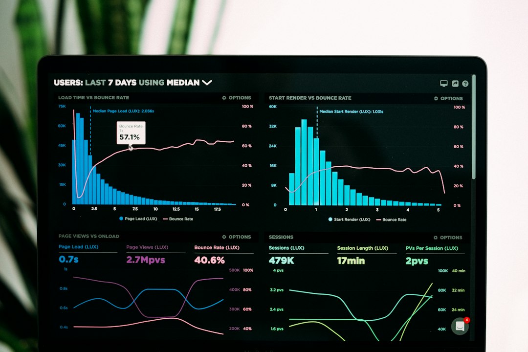
You cannot improve what you never measure. At minimum, track visits and signup rate.
Here is a simple example:
- 1,000 people visit the page.
- 80 people subscribe.
- Your signup rate is 8%.
Then test one change at a time. Change the headline. Or the button. Or the offer. Do not change everything at once. That makes the results messy.
A good test might be:
- Version A: “Subscribe for weekly tips.”
- Version B: “Get one 5-minute sales tip every Monday.”
If Version B wins by 20%, keep it. Then test the button. Small wins stack up.
Final checklist
Before you publish, check the page like a picky reader.
- Is the promise clear in five seconds?
- Is the form easy to find?
- Is the button specific?
- Does the page show proof?
- Can readers preview the newsletter?
- Does it work well on phones?
- Does it load quickly?
- Is the privacy message visible?
A great newsletter page does not beg. It explains, proves, and invites. Keep it simple. Make the reward clear. Then give readers a button they are happy to click.