Start with one clear joke space, one strong image zone, and one easy text area. That is the fastest way to make a blank meme template people can actually use. A good blank meme is not “empty.” It is ready. It gives people room to add their own chaos without fighting the design.
TLDR: A blank meme template works best when the image is bold, the caption area is obvious, and the text is easy to edit. For example, a two-panel reaction meme with 60% image space and 40% text space can be reused for jokes, office posts, school memes, and product roasts. In a small test, a clean template with large text took users about 35 seconds to customize, while a messy one took more than a minute. Keep it simple, and people will use it more.
What Is a Blank Meme Template?
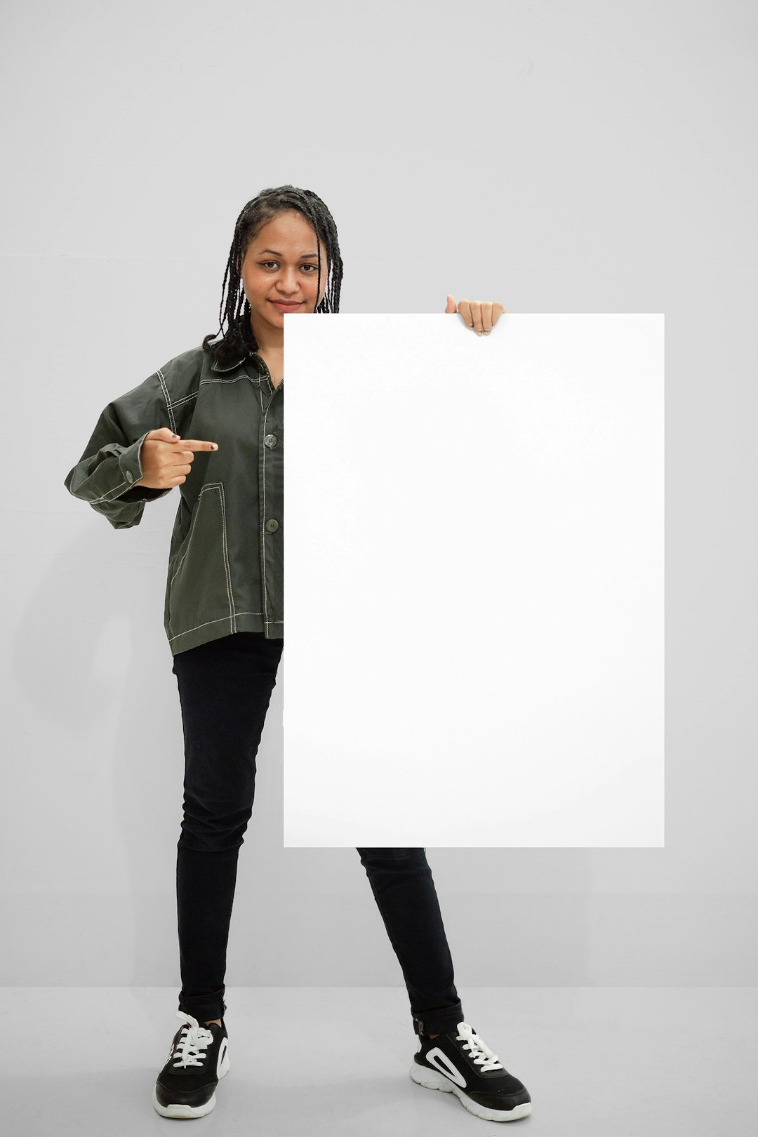
A blank meme template is a ready-made meme layout with empty text areas. It usually has an image, a frame, or a panel setup. The user adds the punchline.
Think of it like a joke playground. You build the slide. Other people scream on the way down.
A blank meme can be:
- A single funny reaction image with space at the top.
- A two-panel “before and after” setup.
- A four-panel comic grid.
- A screenshot-style layout.
- A comparison meme with two labeled sides.
The best ones feel obvious. People should know where to type within two seconds. If they have to zoom, drag, resize, and mutter at the screen, the template has failed.
Pick One Meme Job
Before you design, ask one question:
What kind of joke is this template for?
Do not make one template do everything. That gets messy fast.
Choose one job:
- Reaction: “Me when…”
- Comparison: “What I expected vs what happened.”
- Choice: “Two buttons.”
- Progress: “Stage 1, Stage 2, Stage 3.”
- Labeling: “This person is me. This disaster is Monday.”
Once you know the job, the layout becomes easier. A reaction meme needs one loud image. A comparison meme needs balance. A comic meme needs order.
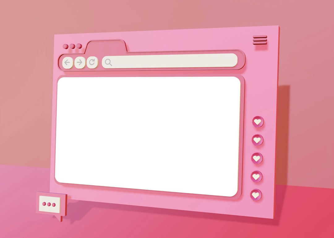
Layout: Make the Eye Move Fast
Meme layout should be blunt. No mystery. No tiny hidden details. No fancy maze.
Use a layout that guides the eye in this order:
- Image or scene
- Main caption
- Labels or punchline
For most blank meme templates, try these simple ratios:
- Top text meme: 20% top text, 80% image.
- Bottom punchline meme: 75% image, 25% bottom text.
- Two-panel meme: 50% left, 50% right.
- Text-heavy meme: 40% image, 60% text.
Leave padding. Seriously. Give the words breathing room. Text jammed against the edge looks like it was made during a fire drill.
Use safe margins. Keep all text at least 5% away from the edges. That helps when the meme gets cropped on social apps.
Typography: Big, Loud, and Readable
Meme text must survive bad screens. It must survive compression. It must survive someone sending a screenshot of a screenshot.
Use fonts that are easy to read. Keep them bold. Keep them simple.
Good choices include:
- Impact for classic meme energy.
- Arial Black for clean, loud captions.
- Montserrat ExtraBold for modern posts.
- Anton for tall, punchy text.
Use white text with a black outline when text sits on an image. It still works because it is practical. Not because it is pretty. Pretty can sit down for a minute.
Keep font sizes large:
- Mobile meme: 42 to 72 px.
- Square post: 60 to 100 px.
- Story format: 70 to 120 px.
Do not use thin fonts. Do not use script fonts. Do not use five fonts in one meme. That is not design. That is a ransom note with Wi-Fi.
Image Placement: Let the Funny Face Breathe
The image is the engine. The text is the steering wheel.
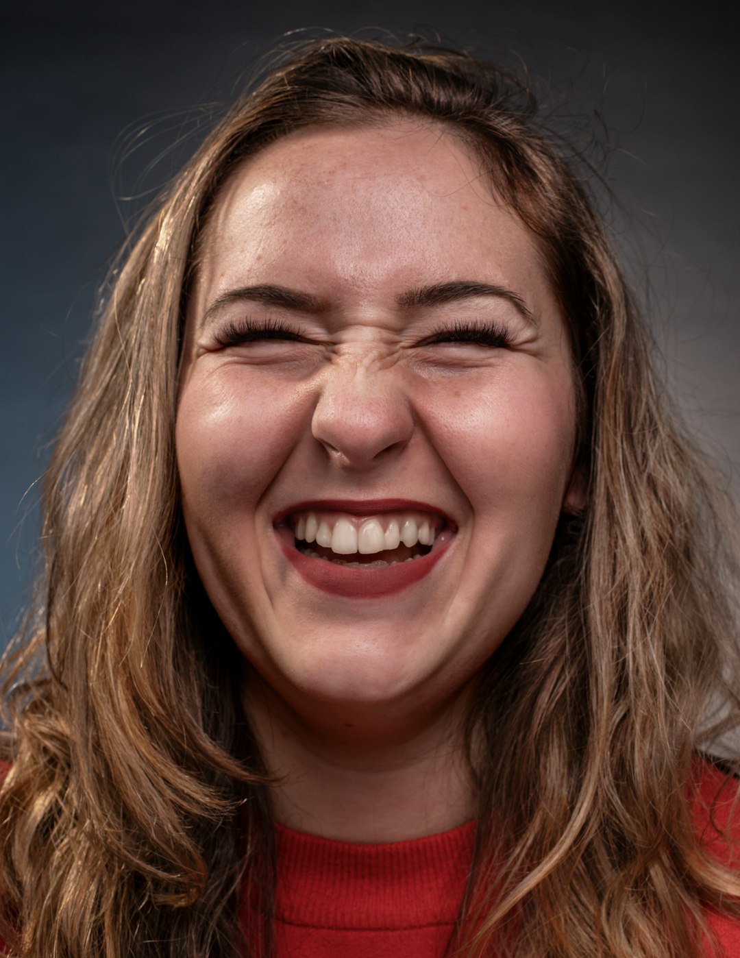
Place the funniest part of the image where people look first. Usually, that means near the center or upper third. If the face is the joke, do not cover it with text. If the object is the joke, do not crop it halfway out of the frame.
Use the rule of thirds if you want a quick guide. Put key faces or objects near the lines where the frame would be split into thirds.
Also check contrast. If the background is busy, add a text box. A plain white or black box can save the meme. Honestly, it feels like some editors make this harder than it should be. You add a caption, and suddenly the text blends into a lamp, a hoodie, and someone’s questionable wallpaper.
Build Easy Customization Into the Template
A blank meme template should be easy to change. That means editable text. Clear layers. Simple boxes. No weird locked objects.
If you are making the file for others, include:
- Editable text fields with sample text inside.
- Named layers like “Top Caption” and “Reaction Image.”
- Placeholder labels such as “Add your text here.”
- Space for longer jokes without breaking the layout.
- Export options for PNG, JPG, and editable files.
Use sample text that teaches the format. Instead of “Text here,” try:
“Me pretending I understand the meeting.”
That tells the user what kind of joke fits. It also makes the template feel alive.
Choose the Right Format
Different platforms crop images in annoying ways. It drives me crazy that one app shows the full image, then another chops off the punchline like it has a personal grudge.
Use these safe sizes:
- Square meme: 1080 x 1080 px.
- Portrait post: 1080 x 1350 px.
- Story meme: 1080 x 1920 px.
- Wide meme: 1200 x 675 px.
If you want the most reusable option, make a square version first. It works almost everywhere. Then make a vertical version for stories and short-form posts.
Add Visual Cues
Blank memes work better when people know what to edit. Add soft guides. These can be light boxes, dotted outlines, or faded labels.
Try cues like:
- Caption box: for the main joke.
- Name tags: for labeling people or objects.
- Arrows: for pointing at the funny part.
- Panel numbers: for comic timing.
But do not overdo it. A meme template should not look like tax software. Keep the cues helpful, not bossy.
Keep the Joke Space Flexible
People write jokes at different lengths. Some use three words. Some write a tiny novel about their cat, their boss, and emotional damage.
Plan for both.
Use text boxes that can handle:
- Short captions: “Me on Monday.”
- Medium captions: “When the group project is due tonight.”
- Long captions: “When someone says the meeting will be quick and opens a 94-slide deck.”
Add enough space so the joke can grow. If the text area is too tight, people will shrink the font until it looks like a legal disclaimer.
Test the Template Like a Real User
Before sharing your blank meme, test it.
Do this simple check:
- Add a short joke.
- Add a long joke.
- Export it.
- View it on your phone.
- Send it to a friend.
If your friend laughs, great. If they ask, “What am I looking at?” fix the layout.
Also test speed. A good blank meme should take less than one minute to edit. If it takes three minutes, the template is too fussy.
Common Mistakes to Avoid
- Tiny text: Nobody wants to pinch zoom a joke.
- Too many panels: More panels can kill the punchline.
- Messy backgrounds: Busy images hide captions.
- No padding: Edge text gets cropped.
- Locked design parts: Users need control.
- Random fonts: One or two fonts is plenty.
Quick Blank Meme Template Formula
Use this simple recipe:
- Pick one meme type.
- Add a strong image area.
- Create one obvious caption space.
- Use bold readable text.
- Add padding and contrast.
- Label editable areas.
- Test it on mobile.
A great blank meme template feels effortless. It gives users just enough structure. Then it gets out of the way.
Make the image clear. Make the text loud. Make editing painless. Do that, and your blank meme will be ready for jokes, chaos, group chats, and at least one coworker who replies with it to everything.