Accessible web design is no longer a specialist concern; it is a core part of professional digital work. When designers create interfaces that support people with visual, motor, auditory, cognitive, or temporary impairments, they improve usability for everyone. The strongest results usually come from combining thoughtful design decisions with reliable accessibility testing tools.
TLDR: The best accessibility tools help web designers identify issues with color contrast, keyboard navigation, semantic structure, forms, and screen reader support. No single tool can guarantee full accessibility, so teams should combine automated testing with manual review. Tools such as WAVE, axe DevTools, Lighthouse, Stark, Accessibility Insights, and Color Oracle can make accessibility easier to understand, test, and improve throughout the design process.
Why Accessibility Tools Matter for Web Designers
Accessibility tools help designers catch problems before they become expensive development issues. A design may look polished, but it can still fail users if text contrast is weak, headings are confusing, buttons are unlabeled, or interactive elements cannot be reached with a keyboard. These tools provide practical feedback that supports standards such as the Web Content Accessibility Guidelines, often known as WCAG.
However, accessibility tools should not be treated as a replacement for human judgment. Automated checks can detect many common errors, but they cannot fully evaluate clarity, reading level, user intent, or whether an experience feels intuitive. The best approach is a blended workflow: automated scanning, manual inspection, assistive technology testing, and feedback from real users.
1. WAVE
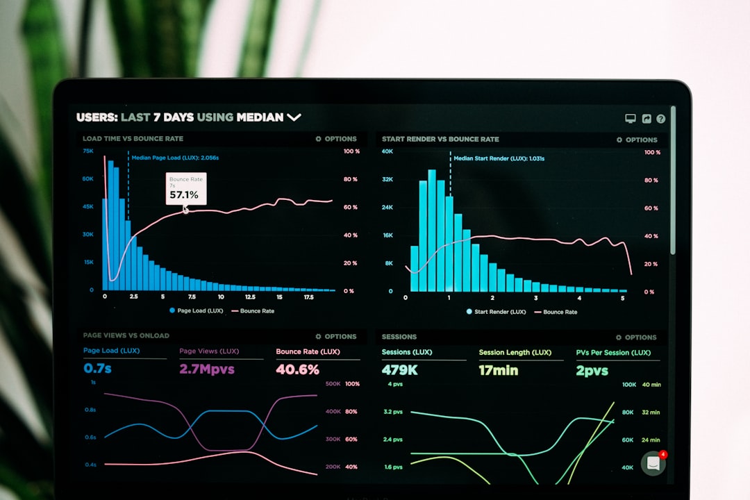
WAVE, created by WebAIM, is one of the most widely used tools for visual accessibility evaluation. It allows designers and teams to inspect a web page and see accessibility concerns directly overlaid on the interface. Errors, alerts, structural elements, contrast issues, and ARIA labels are displayed in a visual format that is easy to understand.
WAVE is especially useful for designers because it connects technical issues with what appears on the screen. For example, it can show missing alternative text, empty buttons, skipped heading levels, and low contrast text. This makes it easier for designers to understand how layout and content decisions affect real users.
- Best for: Visual page audits and quick accessibility reviews.
- Strength: Clear, page-level feedback that is easy to interpret.
- Limitation: It cannot fully judge whether alternative text is meaningful.
2. axe DevTools
axe DevTools is a powerful accessibility testing browser extension from Deque. It is popular among developers, but it is also valuable for web designers who work closely with product teams. The tool scans pages for accessibility violations and explains why each issue matters, where it appears, and how it can be fixed.
One of its major advantages is its strong rule engine. It helps identify problems related to labels, roles, contrast, landmarks, ARIA usage, and page structure. Designers can use the results to understand how visual patterns translate into accessible or inaccessible code.
- Best for: Detailed browser-based accessibility testing.
- Strength: Reliable issue detection with practical explanations.
- Limitation: Some findings require technical knowledge to resolve.
3. Google Lighthouse
Google Lighthouse is built into Chrome DevTools and provides audits for performance, SEO, best practices, and accessibility. Its accessibility score gives teams a quick overview of common issues on a page, making it useful during design reviews, QA checks, and stakeholder conversations.
Lighthouse checks items such as color contrast, button names, image alt text, document titles, heading order, and form labels. Its scoring system can motivate improvements, but teams should avoid treating the score as a complete measure of accessibility. A page can receive a high score and still contain significant usability barriers.
- Best for: Fast audits during design and development reviews.
- Strength: Easy access inside Chrome with broad quality metrics.
- Limitation: The score is helpful but not comprehensive.
4. Stark
Stark is a design-focused accessibility platform that integrates with popular design environments and browsers. It is particularly helpful for checking color contrast, simulating color blindness, reviewing typography, and maintaining accessible design systems. For web designers, Stark can bring accessibility checks into the early stages of visual design rather than leaving them until development.
Its contrast checker helps designers confirm that text and interface elements meet WCAG contrast requirements. Its vision simulation features also help teams see how a design may appear to users with different types of color vision deficiency. This supports better decisions around color, emphasis, states, and visual hierarchy.
- Best for: Accessibility checks inside the design workflow.
- Strength: Strong support for color, typography, and design systems.
- Limitation: It focuses more on design-stage issues than full page behavior.
5. Accessibility Insights
Accessibility Insights, developed by Microsoft, offers guided accessibility testing for web experiences. It includes automated checks as well as a structured manual testing process called Assessment. This makes it useful for teams that want more than a quick scan and need a repeatable review method.
Designers can use Accessibility Insights to better understand keyboard navigation, focus order, landmarks, contrast, and interactive behavior. Its guided process encourages testers to inspect experiences in a more thoughtful way, rather than relying only on automated findings.
- Best for: Structured accessibility reviews and manual testing.
- Strength: Combines automation with guided human evaluation.
- Limitation: Full assessments take more time than quick scanners.
6. Color Oracle
Color Oracle is a free color blindness simulator that works across the screen rather than only inside a browser or design file. It allows designers to preview how interfaces may appear to people with common forms of color vision deficiency, including deuteranopia, protanopia, and tritanopia.
This tool is especially useful when a design relies heavily on color to communicate meaning. Error states, success messages, charts, maps, and buttons should not depend on color alone. By viewing work through Color Oracle, designers can identify where icons, labels, patterns, or text cues are needed to make information clearer.
- Best for: Testing color-dependent interface decisions.
- Strength: Simple screen-wide simulation of color vision differences.
- Limitation: It does not test code, structure, or screen reader support.

How Designers Should Use These Tools Together
The most effective accessibility workflow uses several tools at different stages. During early design, Stark and Color Oracle can help evaluate color, contrast, and visual clarity. During prototyping and development, WAVE, axe DevTools, Lighthouse, and Accessibility Insights can identify structural and interaction problems.
Designers should also remember to test essential experiences manually. A person should be able to move through a page with a keyboard, understand focus indicators, complete forms, read content in a logical order, and identify the purpose of every interactive element. If possible, teams should include people with disabilities in usability testing, because real feedback often reveals issues no automated tool can detect.
FAQ
What is the best accessibility tool for web designers?
There is no single best tool for every situation. Stark is excellent during visual design, while WAVE, axe DevTools, and Accessibility Insights are better for reviewing live pages and prototypes.
Can automated tools make a website fully accessible?
No. Automated tools can find many common issues, but they cannot fully evaluate usability, content quality, or whether an experience works well with assistive technology. Manual testing is still necessary.
Which tool is best for checking color contrast?
Stark is a strong option for design files and design systems, while WAVE and Lighthouse can check contrast on live web pages.
Should designers learn WCAG?
Yes. Designers do not need to memorize every technical detail, but understanding WCAG principles helps them make better decisions about contrast, structure, navigation, forms, and content clarity.
How often should accessibility testing happen?
Accessibility testing should happen throughout the project, not only before launch. The best teams review accessibility during wireframing, visual design, development, QA, and ongoing maintenance.