Ever wonder why old comics look so cool? Those tiny dots are doing a lot of work. They add texture, drama, and a lovely printed feel. That dot pattern is called a halftone filter, and it can turn a plain image into something bold, retro, and fun.
TLDR: A halftone filter turns smooth colors and shadows into patterns of tiny dots. It is great for making vintage print, pop art, and comic book effects. You can use it on photos, posters, logos, and illustrations. The trick is to balance dot size, contrast, color, and texture.
What Is a Halftone Filter?
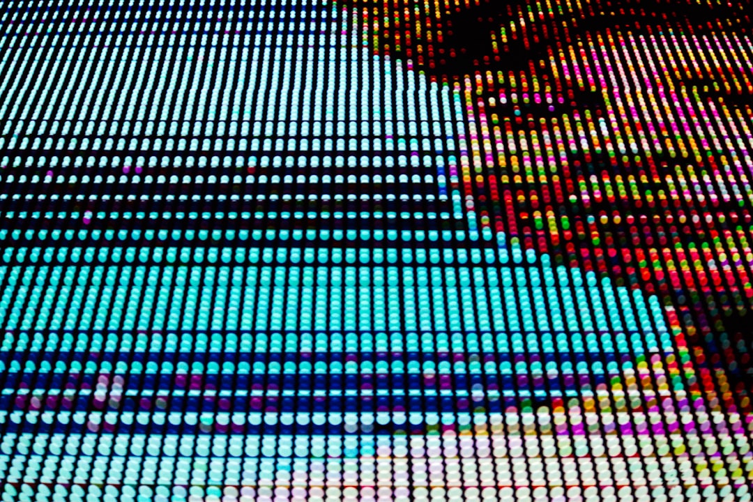
A halftone filter is a visual effect that breaks an image into dots. Big dots make dark areas. Small dots make light areas. From far away, your eye blends the dots together.
This method comes from old printing. Printers could not always print smooth gradients. So they used dot patterns to fake shadows, tones, and depth. Clever, right?
Today, we use halftone effects for style. They make images feel printed, handmade, and a little imperfect. That is the charm.
Why Halftone Looks So Vintage
Halftone has a strong link to old newspapers, magazines, posters, and comic books. It reminds us of ink on paper. It feels tactile. It has grit.
Modern digital images are often clean and smooth. Sometimes too smooth. A halftone effect adds life. It creates a little noise. It gives your design a printed soul.
It also adds instant personality. A simple photo can become:
- A comic book hero portrait
- A bold pop art design
- A retro music poster
- A vintage ad style image
- A punchy social media graphic
How the Effect Works
Think of a halftone filter as a dot machine. It looks at the light and dark parts of your image. Then it replaces smooth shading with dots.
Here is the simple version:
- Dark areas get larger dots.
- Light areas get smaller dots.
- Midtones get medium dots.
- The dots line up in a grid or angled pattern.
That is it. Easy magic.
You can also use different shapes. Dots are classic. But you can try lines, diamonds, circles, waves, or tiny squares. Dots feel comic. Lines feel engraved. Squares feel digital. Each shape gives a different mood.
Best Images for Halftone Effects
Not every image needs the same treatment. Some images love halftone more than others.
Choose images with clear contrast. Strong lights and shadows work well. Faces are great. Product shots can work. Simple illustrations work too.
Avoid images that are too busy. Tiny details may turn messy. If your photo has too much going on, simplify it first. Crop tighter. Increase contrast. Remove clutter.
Good choices include:
- Portraits with strong lighting
- Action poses
- City scenes with shadows
- Black and white photos
- Simple mascot or character art
Key Settings to Play With
Most image editors give you a few settings for halftone effects. The names may change, but the ideas stay the same.
1. Dot Size
Dot size controls how chunky the pattern looks. Big dots feel loud and graphic. Small dots feel softer and more realistic.
For comic book style, try medium to large dots. For vintage newspaper style, try small dots.
2. Dot Spacing
Spacing controls the distance between dots. Tight spacing gives more detail. Wide spacing gives a bold poster look.
If your design looks muddy, increase the spacing. Let the dots breathe.
3. Angle
Old print screens often used angled dot patterns. A slight angle makes the effect feel more authentic. Try 15, 30, or 45 degrees.
Do not stress too much. If it looks cool, it works.
4. Contrast
Contrast is the secret sauce. More contrast means more drama. Less contrast means a softer print look.
For comic book effects, boost contrast. Make the shadows punchy. Make the highlights clear.
5. Color
Classic comics often use limited colors. Think red, blue, yellow, black, and cream. These colors feel retro right away.
You can also use a modern palette. Neon pink and cyan look wild. Dark purple and orange look moody. Try things. Break rules.
How to Create a Vintage Print Look
Want an old poster or newspaper vibe? Keep it warm and simple.
Start with a photo or illustration. Turn it black and white if needed. Increase the contrast a little. Add a halftone dot pattern. Then add a slight paper texture.
Use off-white instead of pure white. Use dark brown or faded black instead of perfect black. This makes the design feel aged.
Try this recipe:
- Use small or medium dots
- Set the dots at a slight angle
- Add a warm cream background
- Lower the saturation
- Add light grain or paper texture
Now your design feels like it came from an old magazine rack. Nice.
How to Create a Comic Book Effect
Comic book style is bold. It needs strong shapes. It needs bright colors. It needs drama.
First, boost the contrast. Then sharpen the image a bit. Add thick outlines if you can. This helps the artwork feel illustrated.
Next, apply the halftone filter to the shadows or midtones. You do not need dots everywhere. In fact, too many dots can make the image noisy.
Use a bright background. Add speech bubbles. Add action words like “BAM!”, “WOW!”, or “ZAP!” if it fits. Keep it playful.
Try this recipe:
- Use large dots for a bold effect
- Use black outlines
- Pick bright flat colors
- Add dramatic shadows
- Use simple comic fonts and speech bubbles
Common Mistakes to Avoid
Halftone is fun, but it can get messy fast. Here are a few traps to avoid.
- Using dots that are too small: They may disappear on screens.
- Using dots that are too large: Faces can become hard to read.
- Adding too much texture: The design can look dirty.
- Forgetting contrast: The effect may look flat.
- Using too many colors: The retro mood can get lost.
Less is often better. Let the dots be the star. But do not let them steal the whole show.
Where to Use Halftone Effects
Halftone works in many places. It is not just for comics. Use it whenever you want energy and texture.
It is great for:
- Posters and flyers
- Album covers
- Social media graphics
- Sticker designs
- T-shirt prints
- Editorial illustrations
- Event banners
It also works well with typography. Big letters plus halftone texture can look amazing. Try adding dots inside large text. Or place halftone shadows behind words.
Final Tips for Better Results
Zoom out often. Halftone patterns can look strange up close. But from a distance, they may look perfect.
Test your design at the size people will see it. A poster needs different dots than a phone graphic. A tiny sticker needs clear shapes. A big wall print can handle more detail.
Also, save a clean version before you apply the effect. Halftone can be hard to reverse. Keep your original safe.
Most of all, have fun. Halftone is not about perfect realism. It is about style. It is about charm. It is about making your design shout, whisper, crackle, or pop.
So grab a photo. Add some dots. Push the contrast. Pick a wild color. Then enjoy that sweet vintage print feeling. Your image just joined the comic book universe.