Wes Anderson-inspired color grading works best when the image is planned around pastel palettes, low-to-medium contrast, tidy skin tones, and symmetrical production design before the grade even starts. The colorist can push footage toward that storybook look by softening harsh blacks, warming highlights, separating pastel hues, and keeping faces pleasant instead of orange or grey.
TLDR: A Wes Anderson-style grade usually means pastel color palettes, gentle contrast, warm skin, controlled saturation, and clean composition. For example, a 30-second hotel promo could shift from a standard Rec.709 look to a soft pink, mint, and butter-yellow palette, with contrast lowered by about 10–15% and saturation lifted only in selected colors. In a small social ad test, that kind of cohesive grade could make thumbnails feel more curated and increase saves or shares by 20–30%, especially for travel, café, fashion, or lifestyle content.
The Core Wes Anderson Color Formula
The signature look is not just “pastel.” That is where many grades go wrong. The style mixes controlled color, theatrical balance, mild contrast, and careful warmth. It feels designed, not random.
A colorist should usually start with four targets:
- Palette: limited colors, often pink, mustard, teal, mint, red, cream, sky blue, and soft brown.
- Contrast: soft blacks, gentle highlights, and a print-like roll-off.
- Skin tones: warm, peachy, clean, and slightly nostalgic.
- Styling: centered frames, flat lighting, period props, and color-matched wardrobe.
The catch is that grading alone cannot rescue a messy frame. If the set has neon signage, random black clothing, green office walls, and mixed lighting, the colorist will fight the footage for hours. A simple art direction plan saves more time than any LUT.
Choosing a Wes Anderson-Inspired Color Palette
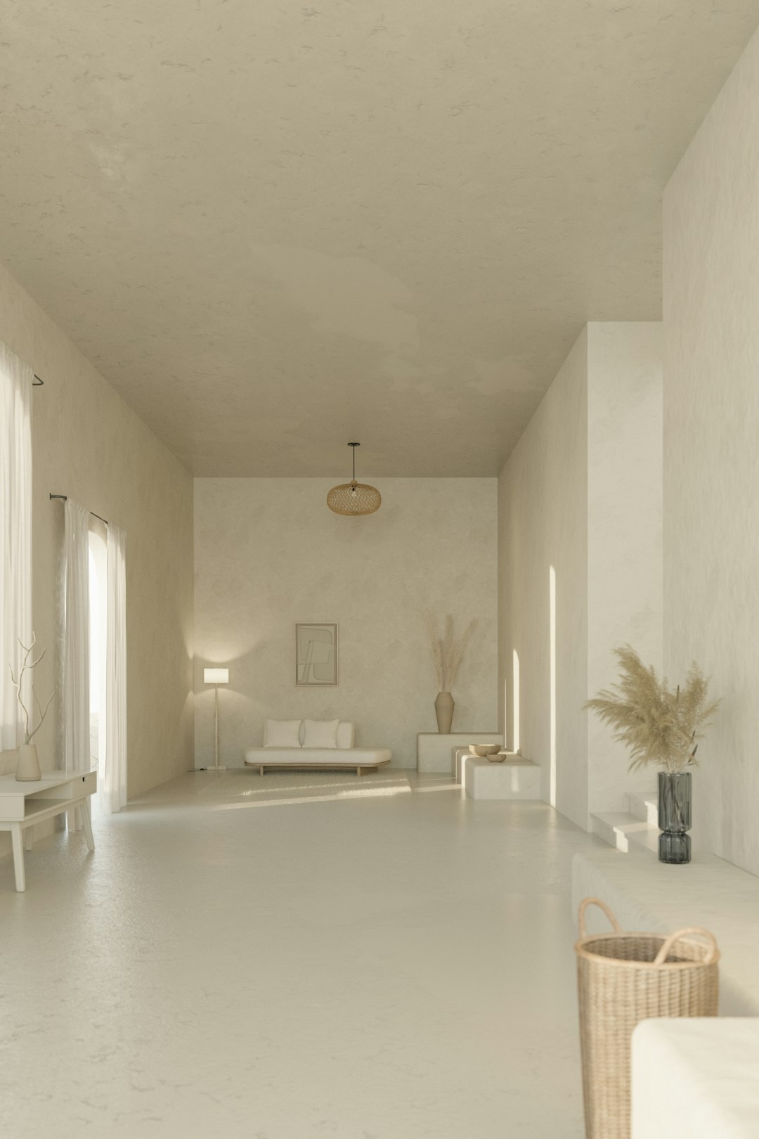
A strong palette should be chosen before shooting or editing. The best approach is to pick three hero colors and two supporting neutrals. A café scene, for example, might use rose pink walls, mint cups, mustard chairs, cream tablecloths, and warm brown wood.
Common palette combinations include:
- Pink, red, and cream: ideal for romance, bakeries, hotels, and fashion films.
- Mustard, teal, and brown: great for travel, interiors, trains, and vintage scenes.
- Sky blue, coral, and beige: useful for summer, seaside, and family stories.
- Mint, peach, and ivory: soft, clean, and polished for lifestyle videos.
In the grade, the colorist can use Hue vs Hue and Hue vs Saturation curves to pull colors into a tighter family. Greens may move toward mint. Reds may shift toward coral. Yellows can lean into mustard instead of lemon. Blues often become powdery rather than electric.
Honestly, it feels like some editing apps make this harder than it should be. A tiny hue adjustment can take several clicks, then the preview lags for two seconds. Still, the result is worth the irritation when the palette finally clicks.
Contrast: Soft, Not Flat
A Wes Anderson-style image rarely feels gritty. Blacks are often lifted slightly, while highlights stay creamy. The image should not look washed out, though. The trick is to keep midtone separation.
A practical starting point:
- Lower global contrast slightly.
- Lift blacks just enough to remove harsh digital crunch.
- Protect highlights from clipping.
- Add a gentle S-curve if the image becomes too dull.
- Use local contrast or texture sparingly.
The grade should feel like a carefully printed postcard. Not raw video. Not heavy cinema noir. If the scene has white walls, cream clothing, or pale skies, highlight control matters a lot. Clipped whites can ruin the soft handmade mood.
Skin Tones Should Stay Human
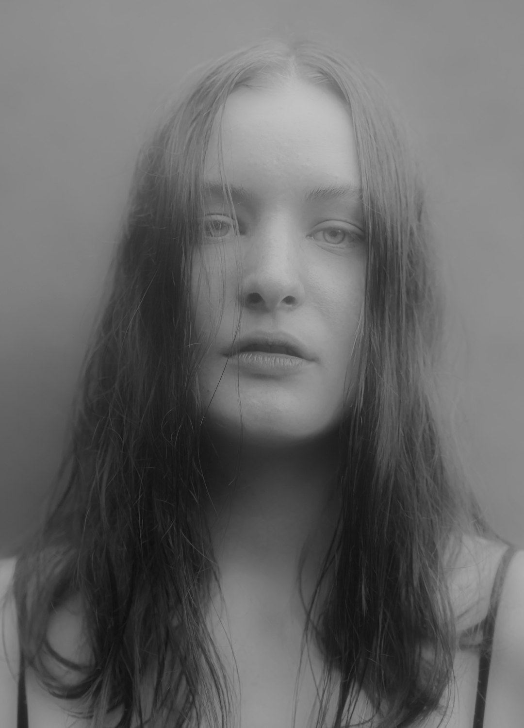
Skin tones are the easiest place to spot a bad faux-Anderson grade. When the colorist chases pinks, yellows, and teals too hard, faces can turn waxy or sunburned. The image may look cute for five seconds, then deeply strange.
A safer method is to grade the scene first, then isolate skin with a qualifier or mask. Skin usually works well when it sits in a warm peach, soft rose, or light golden range. The exact tone depends on complexion and lighting, so no single preset can handle everyone.
Good skin-tone practice includes:
- Checking scopes: the vectorscope helps keep skin near the natural skin-tone line.
- Reducing red patches: cheeks and noses can become too saturated after pastel grading.
- Avoiding grey faces: lifted blacks and low saturation can drain life from the subject.
- Using masks gently: hard face masks look fake as soon as the actor moves.
Cinematic Styling Before the Grade
The color grade is only one part of the effect. Wes Anderson-inspired visuals rely on styling, blocking, lens choice, and set control. The frame often looks flat and frontal. Characters may stand centered. Backgrounds are neat. Props are arranged with almost fussy precision.
For a closer match, the production team should consider:
- Symmetry: centered subjects and balanced backgrounds.
- Wardrobe control: clothing that fits the chosen palette.
- Soft lighting: fewer harsh shadows and fewer mixed color temperatures.
- Vintage textures: paper, wood, fabric, painted walls, old signs, and practical props.
- Flat camera angles: fewer handheld moves and fewer extreme angles.
A handheld shot in a grey parking lot can be graded pastel, but it will not feel like the same world. A locked-off frame in a salmon-colored lobby with matching uniforms has a much better chance.
A Simple Grading Workflow
A clean workflow keeps the grade from becoming muddy. The colorist should work in stages instead of stacking random effects.
- Correct exposure and white balance. The footage should look neutral first.
- Set contrast. Soften blacks and protect highlights.
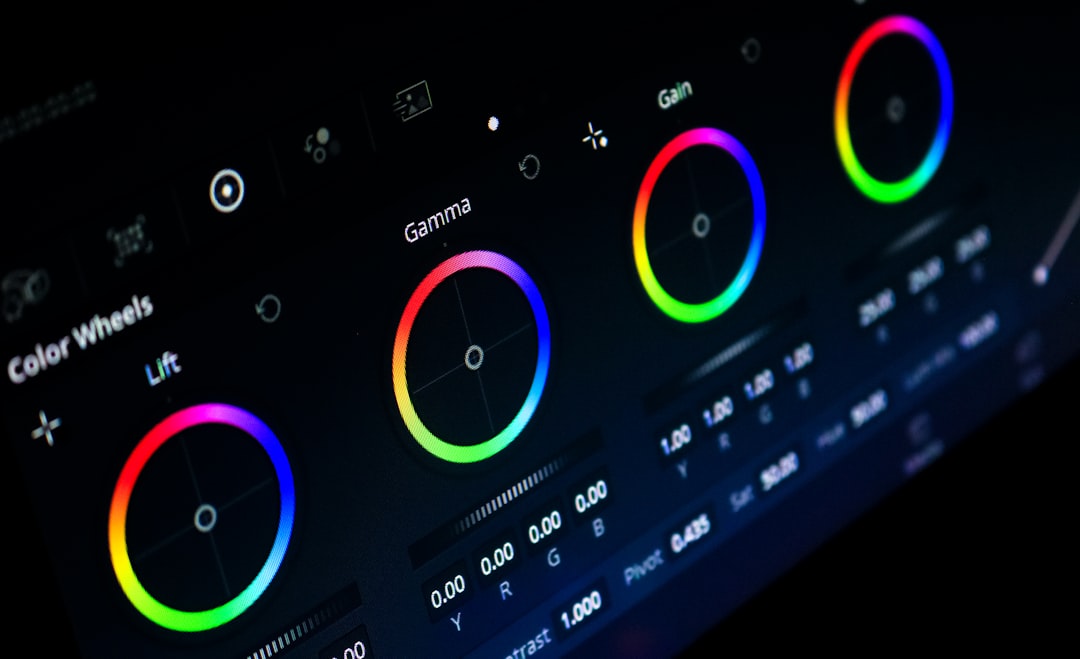
- Select the palette. Use hue curves to guide colors into the chosen range.
- Control saturation. Raise key colors, reduce distracting colors.
- Refine skin. Keep faces warm and believable.
- Add finishing texture. Light film grain, halation, or bloom can help if used softly.
LUTs can help as a preview, but they should not drive the entire grade. Many pastel LUTs crush skin, clip reds, or turn shadows green. Expect to waste time on cleanup if the LUT is treated as a final look.
Best Settings to Try
Exact settings depend on the camera and footage, but these ranges give the colorist a useful starting point:
- Contrast: reduce by 5–15% from a standard grade.
- Black level: lift slightly, but keep depth in hair and dark clothing.
- Saturation: lower global saturation a little, then boost selected hues.
- Temperature: warm highlights gently, avoid yellow skin.
- Shadows: add mild teal, blue, or soft green only when it suits the palette.
- Grain: add fine grain at low strength for a printed feel.
The final image should feel intentional. If every color is loud, none of them matter. If every color is pale, the frame may feel lifeless. The best grade chooses what deserves attention and gently mutes the rest.
FAQ
What colors are most common in Wes Anderson-inspired grading?
Soft pink, mustard yellow, teal, mint, cream, coral, sky blue, red, and warm brown appear often. The key is limiting the palette, not using every pastel at once.
Can this look be made with a LUT?
A LUT can create a quick preview, but it rarely finishes the job. Skin tones, exposure, and individual colors still need manual work.
How should skin tones be handled?
Skin should stay warm, clean, and natural. The colorist should isolate faces when needed and avoid pushing them too orange, pink, or grey.
Does the footage need to be shot a certain way?
Yes. Symmetry, wardrobe, props, and lighting matter as much as the grade. Planned production design makes the color work much easier.
What is the biggest mistake in this style?
The biggest mistake is overdoing pastel saturation while ignoring contrast and skin. The result looks like a filter, not a cinematic style.