A coming soon landing page should collect emails, explain the promise, and build trust before your product is ready. Do not wait until launch day to find your audience. That is how good ideas launch to silence. A simple pre-launch page can turn curious visitors into first users, buyers, and fans.
TLDR: A coming soon page is a one-page teaser for a product, app, event, course, or store that has not launched yet. It should have a clear headline, one main call to action, and a strong reason to sign up. For example, a fitness app could send 2,000 visitors to a pre-launch page, convert 18%, and start launch day with 360 email leads. That is much better than shouting into the void.
What Is a Coming Soon Landing Page?
A coming soon landing page is a temporary page. It tells people what is being built. It also asks them to take one action.
That action is usually:
- Join the waitlist.
- Get early access.
- Pre-order the product.
- Claim a launch discount.
- Follow updates.
The page does not need to be fancy. In fact, simple often wins. People want to know three things fast. What is this? Why should I care? What do I do next?
If your page answers those questions in five seconds, you are already ahead.
Why Coming Soon Pages Work
Launches feel exciting. They also feel messy. You are building the product. Fixing bugs. Writing emails. Testing payments. Wondering why one tiny button broke the whole layout. It drives me crazy that a launch can be delayed by something as silly as a missing form field.
A coming soon page gives you breathing room. It helps you build an audience while the product is still in progress.
It can help you:
- Validate demand before spending more money.
- Collect emails from interested people.
- Test your message with real visitors.
- Create buzz before opening day.
- Learn who cares and why.
Think of it as a mini test. If 1,000 people visit and only 3 sign up, something is off. Maybe the offer is weak. Maybe the headline is confusing. Maybe the audience is wrong. Painful? Yes. Useful? Very.
Great Coming Soon Page Examples
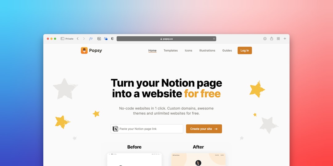
You do not need to copy these exactly. Use them as idea starters.
1. The App Waitlist Page
This page works well for apps, SaaS tools, and online platforms. It usually has a bold headline and a short product promise.
Example headline: “Plan your meals in 60 seconds.”
Best feature: A waitlist form that says, “Get early access.”
Add a mockup of the app. Show one or two screens. Keep it clean. People should understand the result right away.
2. The Product Drop Page
This is great for clothing, gadgets, beauty items, books, and limited releases. It creates urgency.
Example headline: “The travel hoodie with 12 hidden pockets drops May 10.”
Best feature: A countdown timer and early bird discount.
This page should feel sharp. Use strong images. Mention stock limits if they are real. Do not fake scarcity. People can smell that from space.
3. The Course Launch Page
This works for coaches, teachers, and creators. The page should show the result students will get.
Example headline: “Learn beginner food photography in 14 days.”
Best feature: A free lesson or checklist in exchange for email signup.
A course page should also show who it is for. Beginners? Freelancers? Busy parents? Say it clearly.
4. The Event Teaser Page
This page is made for conferences, webinars, local events, and workshops.
Example headline: “A one-day workshop for new Etsy sellers.”
Best feature: Date, city, spots available, and speaker preview.
Visitors should not hunt for basic details. Put the date near the top. Add the signup button twice. Once near the headline. Once after the event details.
Must-Have Features
A good coming soon page is not a junk drawer. Do not add every widget you find. Use what helps people say yes.
- Clear headline: Say the main benefit in plain words.
- Short subheading: Add one sentence with more detail.
- One call to action: Pick one goal. Email signup is usually best.
- Email form: Ask for less. Name and email is enough.
- Launch date: Add it if you know it. If not, say “Launching soon.”
- Visual preview: Show the product, app, cover, or vibe.
- Social proof: Add quotes, user numbers, press logos, or beta feedback.
- Privacy note: Tell people you will not spam them.
- Mobile design: Most visitors may arrive from phones.
Honestly, it feels like some forms are built to scare people away. Six fields for a waitlist? No thanks. Every extra field is a tiny exit sign.
Pre-Launch Best Practices
Start With One Sharp Promise
Your headline should not sound like a corporate fog machine. Be direct.
Weak: “A better way to improve your daily workflow.”
Stronger: “Track freelance invoices without spreadsheet chaos.”
The second one has a person, a problem, and a result. That is what you want.
Offer a Reason to Sign Up
“Join our newsletter” is dull. People hear that and run.
Try these instead:
- Get 30% off at launch.
- Be first to try the beta.
- Get a free template pack.
- Reserve your spot.
- Vote on the next feature.
Give people a small win now. Then they will trust you with their email.
Use a Simple Countdown
A countdown can work well. It gives the page movement. It makes the launch feel real.
But use it with care. If the timer hits zero and nothing happens, trust drops. Nobody enjoys a fake deadline. Set a real date. Or skip the timer.
Send Traffic Early
A coming soon page does nothing if nobody sees it. Share it before you feel ready. Yes, that feels awkward. Do it anyway.
Good traffic sources include:
- Social posts.
- Short videos.
- Paid ads with small budgets.
- Founder updates.
- Reddit or community posts, if allowed.
- Podcast guest spots.
- Email signatures.
Spend $50 to $100 if you can. Test two headlines. See which one gets more signups. Even small numbers can guide smarter choices.
Track the Right Numbers
Do not obsess over pretty charts. Watch the numbers that matter.
- Visitor count: How many people came?
- Conversion rate: What percent signed up?
- Traffic source: Where did good leads come from?
- Form drop-off: Did people start but not finish?
- Email open rate: Are leads still interested?
A healthy signup rate can vary. For a cold audience, 5% to 10% may be fine. For a warm audience, 20% or more is possible. If your offer is very niche and strong, it can go higher.
Follow Up Before Launch
Do not collect emails and vanish. That is weird. Send updates.
You can send:
- A welcome email.
- A behind-the-scenes note.
- A quick survey.
- A beta invite.
- A launch reminder.
Keep emails short. Make them feel human. Ask questions. Replies are gold. They tell you what people want in their own words.
Common Mistakes to Avoid
Coming soon pages are simple. Yet people still make them oddly hard.
- Too much text: Nobody wants a novel on a teaser page.
- No clear action: One button beats five choices.
- Vague wording: Cute copy is not useful if nobody understands it.
- Slow loading: Big images can kill signups.
- No mobile check: Test it on your phone.
- No follow-up: A cold email list gets weaker each week.
A Simple Page Structure You Can Use
Here is a clean layout that works for most launches:
- Hero section: Headline, subheading, email form, and visual.
- Benefit section: Three short reasons to care.
- Preview section: Product image, mockup, or feature sneak peek.
- Proof section: Quotes, stats, beta user notes, or founder story.
- Final call to action: Repeat the signup form.
That is enough. You do not need a giant site. You need a clear promise and a way to capture interest.
Final Tips Before You Publish
Read your page out loud. If it sounds stiff, rewrite it. Cut anything that does not help the signup. Make the button text specific. “Join the waitlist” is fine. “Get early access” is better for many products.
Test the form. Then test it again. Use your own email. Check the thank-you message. Check the welcome email. Small mistakes here cost real leads.
A coming soon page is your launch warm-up. Keep it simple. Make it useful. Give people a reason to care now, not later.